pytrnsys_process.api.scatter_plot#
- pytrnsys_process.api.scatter_plot(df: DataFrame, x_column: str, y_column: str, use_legend: bool = True, size: tuple[float, float] = (7.8, 3.9), **kwargs: Any) tuple[Figure, Axes][source]#
Create a scatter plot to show numerical relationships between x and y variables.
Note
Use color and not cmap!
See: https://pandas.pydata.org/pandas-docs/stable/reference/api/pandas.DataFrame.plot.scatter.html
- Parameters:
df (pandas.DataFrame) – the dataframe to plot
x_column (str) – coloumn name for x-axis values
y_column (str) – coloumn name for y-axis values
- use_legend: bool, default ‘True’
whether to show the legend or not
- size: tuple of (float, float)
size of the figure (width, height)
- **kwargs :
Additional keyword arguments to pass on to
pandas.DataFrame.plot.scatter().
- Return type:
tuple of (
matplotlib.figure.Figure,matplotlib.axes.Axes)
Examples
Simple scatter plot
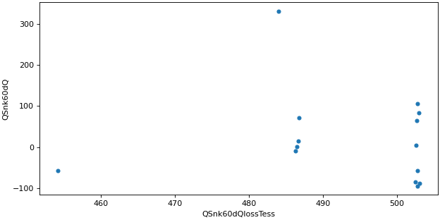
>>> api.scatter_plot(
...     simulation.monthly, x_column="QSnk60dQlossTess", y_column="QSnk60dQ"
... )