pytrnsys_process.api.scalar_compare_plot#
- pytrnsys_process.api.scalar_compare_plot(df: DataFrame, x_column: str, y_column: str, group_by_color: str | None = None, group_by_marker: str | None = None, use_legend: bool = True, size: tuple[float, float] = (7.8, 3.9), scatter_kwargs: dict[str, Any] | None = None, line_kwargs: dict[str, Any] | None = None, **kwargs: Any) tuple[Figure, Axes][source]#
Create a scalar comparison plot with up to two grouping variables. This visualization allows simultaneous analysis of:
Numerical relationships between x and y variables
Categorical grouping through color encoding
Secondary categorical grouping through marker styles
Note
To change the figure properties a separation is included. scatter_kwargs are used to change the markers. line_kwargs are used to change the lines.
See: - markers: https://matplotlib.org/stable/api/_as_gen/matplotlib.axes.Axes.scatter.html - lines: https://matplotlib.org/stable/api/_as_gen/matplotlib.axes.Axes.plot.html
- Parameters:
df (pandas.DataFrame) – the dataframe to plot
x_column (str) – column name for x-axis values
y_column (str) – column name for y-axis values
group_by_color (str, optional) – column name for color grouping
group_by_marker (str, optional) – column name for marker style grouping
use_legend (bool, default 'True') – whether to show the legend or not
size (tuple of (float, float)) – size of the figure (width, height)
line_kwargs – Additional keyword arguments to pass on to
matplotlib.axes.Axes.plot().scatter_kwargs – Additional keyword arguments to pass on to
matplotlib.axes.Axes.scatter().**kwargs – Should never be used! Use ‘line_kwargs’ or ‘scatter_kwargs’ instead.
- Return type:
tuple of (
matplotlib.figure.Figure,matplotlib.axes.Axes)
Examples
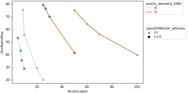
Compare plot
>>> api.scalar_compare_plot(
...     comparison_data,
...     x_column="VIceSscaled",
...     y_column="VIceRatioMax",
...     group_by_color="yearly_demand_GWh",
...     group_by_marker="ratioDHWtoSH_allSinks",
... )