pytrnsys_process.api.get_figure_with_twin_x_axis#
- pytrnsys_process.api.get_figure_with_twin_x_axis() tuple[Figure, Axes, Axes][source]#
Used to make figures with different y axes on the left and right. To create such a figure, pass the lax to one plotting method and pass the rax to another.
Warning
Be careful when combining plots. MatPlotLib will not complain when you provide incompatible x-axes. An example: combining a time-series with dates with a histogram with temperatures. In this case, the histogram will disappear without any feedback.
Note
The legend of a twin_x plot is a special case: To have all entries into a single plot, use fig.legend https://matplotlib.org/stable/api/_as_gen/matplotlib.figure.Figure.legend.html
To instead have two separate legends, one for each y-axis, use lax.legend and rax.legend. https://matplotlib.org/stable/api/_as_gen/matplotlib.axes.Axes.legend.html
- Returns:
fig – Figure object
lax – Axis object for the data on the left y-axis.
rax – Axis object for the data on the right y-axis.
Examples
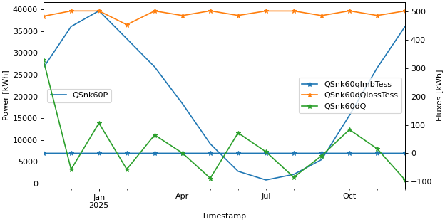
Twin axis plot with a single legend
>>> fig, lax, rax = api.get_figure_with_twin_x_axis()
>>> api.line_plot(simulation.monthly, ["QSnk60P",], ylabel="Power [kWh]", use_legend=False, fig=fig, ax=lax)
>>> api.line_plot(simulation.monthly, ["QSnk60qImbTess", "QSnk60dQlossTess", "QSnk60dQ"], marker="*",
...     ylabel="Fluxes [kWh]", use_legend=False, fig=fig, ax=rax)
>>> fig.legend(loc="center", bbox_to_anchor=(0.6, 0.7))
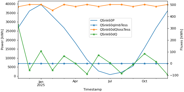
Twin axis plot with two legends
>>> fig, lax, rax = api.get_figure_with_twin_x_axis()
>>> api.line_plot(simulation.monthly, ["QSnk60P",], ylabel="Power [kWh]", use_legend=False, fig=fig, ax=lax)
>>> api.line_plot(simulation.monthly, ["QSnk60qImbTess", "QSnk60dQlossTess", "QSnk60dQ"], marker="*",
...     ylabel="Fluxes [kWh]", use_legend=False, fig=fig, ax=rax)
>>> lax.legend(loc="center left")
>>> rax.legend(loc="center right")