pytrnsys_process.plot package#
Submodules#
pytrnsys_process.plot.plot_wrappers module#
Plotting wrappers to provide a simplified interface to the User, while allow development of reusable OOP structures.
Note
Many of these plotting routines do not add labels and legends. This should be done using the figure and axis handles afterwards.
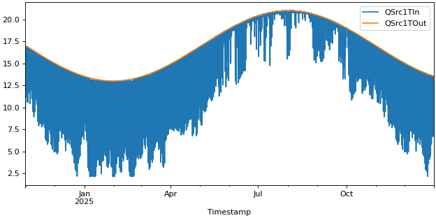
- pytrnsys_process.plot.plot_wrappers.line_plot(df: DataFrame, columns: list[str], use_legend: bool = True, size: tuple[float, float] = (7.8, 3.9), **kwargs: Any) tuple[Figure, Axes][source]#
Create a line plot using the provided DataFrame columns.
- Parameters:
df (pandas.DataFrame) – the dataframe to plot
use_legend (bool, default 'True') – whether to show the legend or not
size (tuple of (float, float)) – size of the figure (width, height)
**kwargs – Additional keyword arguments are documented in
pandas.DataFrame.plot().
- Return type:
tuple of (
matplotlib.figure.Figure,matplotlib.axes.Axes)
Examples
>>> api.line_plot(simulation.hourly, ["QSrc1TIn", "QSrc1TOut"])
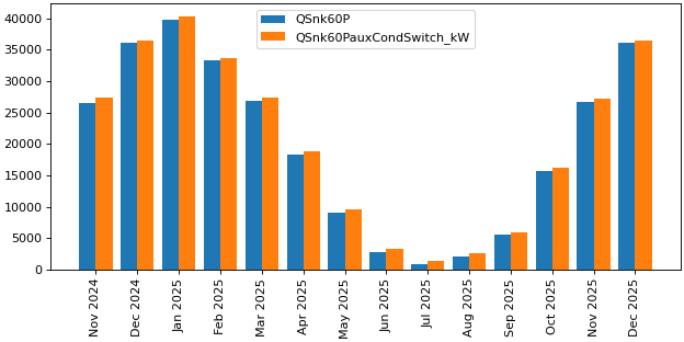
- pytrnsys_process.plot.plot_wrappers.bar_chart(df: DataFrame, columns: list[str], use_legend: bool = True, size: tuple[float, float] = (7.8, 3.9), **kwargs: Any) tuple[Figure, Axes][source]#
Create a bar chart with multiple columns displayed as grouped bars. The **kwargs are currently not passed on.
- Parameters:
df (pandas.DataFrame) – the dataframe to plot
use_legend (bool, default 'True') – whether to show the legend or not
size (tuple of (float, float)) – size of the figure (width, height)
**kwargs – Additional keyword arguments to pass on to
pandas.DataFrame.plot().
- Return type:
tuple of (
matplotlib.figure.Figure,matplotlib.axes.Axes)
Examples
>>> api.bar_chart(simulation.monthly, ["QSnk60P","QSnk60PauxCondSwitch_kW"])
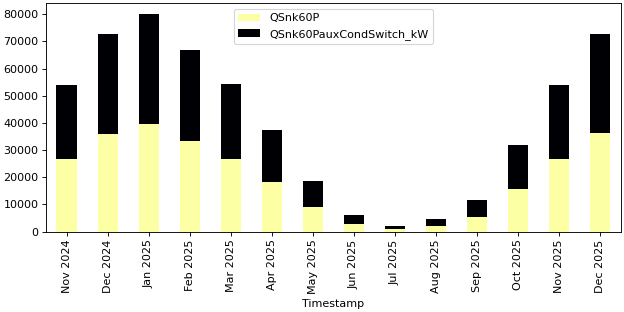
- pytrnsys_process.plot.plot_wrappers.stacked_bar_chart(df: DataFrame, columns: list[str], use_legend: bool = True, size: tuple[float, float] = (7.8, 3.9), **kwargs: Any) tuple[Figure, Axes][source]#
Bar chart with stacked bars
- Parameters:
df (pandas.DataFrame) – the dataframe to plot
use_legend (bool, default 'True') – whether to show the legend or not
size (tuple of (float, float)) – size of the figure (width, height)
**kwargs – Additional keyword arguments to pass on to
pandas.DataFrame.plot().
- Return type:
tuple of (
matplotlib.figure.Figure,matplotlib.axes.Axes)
Examples
>>> api.stacked_bar_chart(simulation.monthly, ["QSnk60P","QSnk60PauxCondSwitch_kW"])
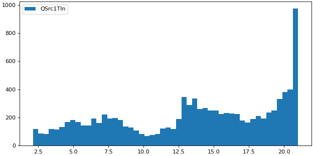
- pytrnsys_process.plot.plot_wrappers.histogram(df: DataFrame, columns: list[str], use_legend: bool = True, size: tuple[float, float] = (7.8, 3.9), bins: int = 50, **kwargs: Any) tuple[Figure, Axes][source]#
Create a histogram from the given DataFrame columns.
- Parameters:
df (pandas.DataFrame) – the dataframe to plot
use_legend (bool, default 'True') – whether to show the legend or not
size (tuple of (float, float)) – size of the figure (width, height)
bins (int) – number of histogram bins to be used
**kwargs – Additional keyword arguments to pass on to
pandas.DataFrame.plot().
- Return type:
tuple of (
matplotlib.figure.Figure,matplotlib.axes.Axes)
Examples
>>> api.histogram(simulation.hourly, ["QSrc1TIn"], ylabel="")

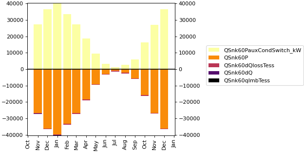
- pytrnsys_process.plot.plot_wrappers.energy_balance(df: DataFrame, q_in_columns: list[str], q_out_columns: list[str], q_imb_column: str | None = None, use_legend: bool = True, size: tuple[float, float] = (7.8, 3.9), **kwargs: Any) tuple[Figure, Axes][source]#
Create a stacked bar chart showing energy balance with inputs, outputs and imbalance. This function creates an energy balance visualization where:
Input energies are shown as positive values
Output energies are shown as negative values
Energy imbalance is either provided or calculated as (sum of inputs + sum of outputs)
- Parameters:
df (pandas.DataFrame) – the dataframe to plot
q_in_columns (list of str) – column names representing energy inputs
q_out_columns (list of str) – column names representing energy outputs
q_imb_column (list of str, optional) – column name containing pre-calculated energy imbalance
use_legend (bool, default 'True') – whether to show the legend or not
size (tuple of (float, float)) – size of the figure (width, height)
**kwargs – Additional keyword arguments to pass on to
pandas.DataFrame.plot().
- Return type:
tuple of (
matplotlib.figure.Figure,matplotlib.axes.Axes)
Examples
>>> api.energy_balance(
>>> simulation.monthly,
>>> q_in_columns=["QSnk60PauxCondSwitch_kW"],
>>> q_out_columns=["QSnk60P", "QSnk60dQlossTess", "QSnk60dQ"],
>>> q_imb_column="QSnk60qImbTess",
>>> xlabel=""
>>> )

- pytrnsys_process.plot.plot_wrappers.energy_balance_with_lines(df: DataFrame, q_in_columns: list[str], q_out_columns: list[str], line_columns: list[str] | None = None, q_imb_column: str | None = None, use_legend: bool = True, size: tuple[float, float] = (7.8, 3.9), **kwargs: Any) tuple[Figure, Axes, Axes][source]#
Create a stacked bar chart showing energy balance with inputs, outputs and imbalance. On top of which one or more lines will be plotted.
This function creates an energy balance visualization where:
Input energies are shown as positive values
Output energies are shown as negative values
Energy imbalance is either provided or calculated as (sum of inputs + sum of outputs)
- Parameters:
df (pandas.DataFrame) – the dataframe to plot
q_in_columns (list of str) – column names representing energy inputs
q_out_columns (list of str) – column names representing energy outputs
q_imb_column (list of str, optional) – column name containing pre-calculated energy imbalance
line_columns (list of str) – column names that should be plotted as line on top of the energy balance.
use_legend (bool, default 'True') – whether to show the legend or not
size (tuple of (float, float)) – size of the figure (width, height)
energy_balance_ylabel (str) – y-axis label for the energy balance.
line_ylabel (str) – y-axis label for the lines.
**kwargs – Additional keyword arguments to pass on to
pandas.DataFrame.plot().
- Return type:
tuple of (
matplotlib.figure.Figure,matplotlib.axes.Axes)
Examples
>>> api.energy_balance_with_lines(
>>> simulation.monthly,
>>> q_in_columns=["QSnk60PauxCondSwitch_kW"],
>>> q_out_columns=["QSnk60P", "QSnk60dQlossTess", "QSnk60dQ"],
>>> q_imb_column="QSnk60qImbTess",
>>> xlabel=""
>>> )
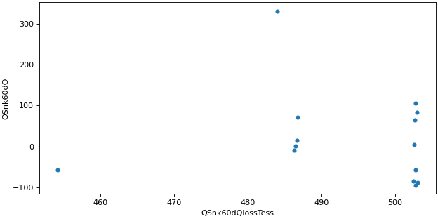
- pytrnsys_process.plot.plot_wrappers.scatter_plot(df: DataFrame, x_column: str, y_column: str, use_legend: bool = True, size: tuple[float, float] = (7.8, 3.9), **kwargs: Any) tuple[Figure, Axes][source]#
Create a scatter plot to show numerical relationships between x and y variables.
Note
Use color and not cmap!
See: https://pandas.pydata.org/pandas-docs/stable/reference/api/pandas.DataFrame.plot.scatter.html
- Parameters:
df (pandas.DataFrame) – the dataframe to plot
x_column (str) – coloumn name for x-axis values
y_column (str) – coloumn name for y-axis values
- use_legend: bool, default ‘True’
whether to show the legend or not
- size: tuple of (float, float)
size of the figure (width, height)
- **kwargs :
Additional keyword arguments to pass on to
pandas.DataFrame.plot.scatter().
- Return type:
tuple of (
matplotlib.figure.Figure,matplotlib.axes.Axes)
Examples
Simple scatter plot
>>> api.scatter_plot(
...     simulation.monthly, x_column="QSnk60dQlossTess", y_column="QSnk60dQ"
... )

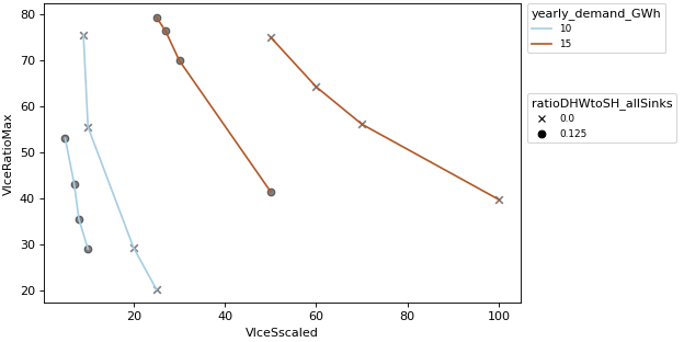
- pytrnsys_process.plot.plot_wrappers.scalar_compare_plot(df: DataFrame, x_column: str, y_column: str, group_by_color: str | None = None, group_by_marker: str | None = None, use_legend: bool = True, size: tuple[float, float] = (7.8, 3.9), scatter_kwargs: dict[str, Any] | None = None, line_kwargs: dict[str, Any] | None = None, **kwargs: Any) tuple[Figure, Axes][source]#
Create a scalar comparison plot with up to two grouping variables. This visualization allows simultaneous analysis of:
Numerical relationships between x and y variables
Categorical grouping through color encoding
Secondary categorical grouping through marker styles
Note
To change the figure properties a separation is included. scatter_kwargs are used to change the markers. line_kwargs are used to change the lines.
See: - markers: https://matplotlib.org/stable/api/_as_gen/matplotlib.axes.Axes.scatter.html - lines: https://matplotlib.org/stable/api/_as_gen/matplotlib.axes.Axes.plot.html
- Parameters:
df (pandas.DataFrame) – the dataframe to plot
x_column (str) – column name for x-axis values
y_column (str) – column name for y-axis values
group_by_color (str, optional) – column name for color grouping
group_by_marker (str, optional) – column name for marker style grouping
use_legend (bool, default 'True') – whether to show the legend or not
size (tuple of (float, float)) – size of the figure (width, height)
line_kwargs – Additional keyword arguments to pass on to
matplotlib.axes.Axes.plot().scatter_kwargs – Additional keyword arguments to pass on to
matplotlib.axes.Axes.scatter().**kwargs – Should never be used! Use ‘line_kwargs’ or ‘scatter_kwargs’ instead.
- Return type:
tuple of (
matplotlib.figure.Figure,matplotlib.axes.Axes)
Examples
Compare plot
>>> api.scalar_compare_plot(
...     comparison_data,
...     x_column="VIceSscaled",
...     y_column="VIceRatioMax",
...     group_by_color="yearly_demand_GWh",
...     group_by_marker="ratioDHWtoSH_allSinks",
... )

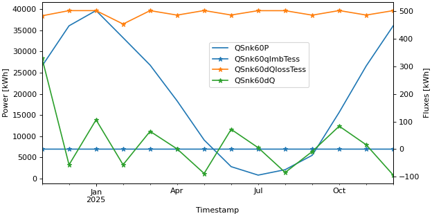
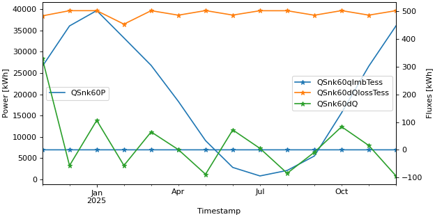
- pytrnsys_process.plot.plot_wrappers.get_figure_with_twin_x_axis() tuple[Figure, Axes, Axes][source]#
Used to make figures with different y axes on the left and right. To create such a figure, pass the lax to one plotting method and pass the rax to another.
Warning
Be careful when combining plots. MatPlotLib will not complain when you provide incompatible x-axes. An example: combining a time-series with dates with a histogram with temperatures. In this case, the histogram will disappear without any feedback.
Note
The legend of a twin_x plot is a special case: To have all entries into a single plot, use fig.legend https://matplotlib.org/stable/api/_as_gen/matplotlib.figure.Figure.legend.html
To instead have two separate legends, one for each y-axis, use lax.legend and rax.legend. https://matplotlib.org/stable/api/_as_gen/matplotlib.axes.Axes.legend.html
- Returns:
fig – Figure object
lax – Axis object for the data on the left y-axis.
rax – Axis object for the data on the right y-axis.
Examples
Twin axis plot with a single legend
>>> fig, lax, rax = api.get_figure_with_twin_x_axis()
>>> api.line_plot(simulation.monthly, ["QSnk60P",], ylabel="Power [kWh]", use_legend=False, fig=fig, ax=lax)
>>> api.line_plot(simulation.monthly, ["QSnk60qImbTess", "QSnk60dQlossTess", "QSnk60dQ"], marker="*",
...     ylabel="Fluxes [kWh]", use_legend=False, fig=fig, ax=rax)
>>> fig.legend(loc="center", bbox_to_anchor=(0.6, 0.7))

Twin axis plot with two legends
>>> fig, lax, rax = api.get_figure_with_twin_x_axis()
>>> api.line_plot(simulation.monthly, ["QSnk60P",], ylabel="Power [kWh]", use_legend=False, fig=fig, ax=lax)
>>> api.line_plot(simulation.monthly, ["QSnk60qImbTess", "QSnk60dQlossTess", "QSnk60dQ"], marker="*",
...     ylabel="Fluxes [kWh]", use_legend=False, fig=fig, ax=rax)
>>> lax.legend(loc="center left")
>>> rax.legend(loc="center right")

pytrnsys_process.plot.plotters module#
- pytrnsys_process.plot.plotters.plot_settings = Plot(file_formats=['.png', '.pdf', '.emf'], figure_sizes={'A4': (7.8, 3.9), 'A4_HALF': (3.8, 3.9)}, inkscape_path='C://Program Files//Inkscape//bin//inkscape.exe', date_format='%b %Y', label_font_size=10, legend_font_size=8, title_font_size=12, markers=['x', 'o', '^', 'D', 'v', '<', '>', 'p', '*', 's'])#
Settings shared by all plots
- class pytrnsys_process.plot.plotters.ScalarComparePlot[source]#
Bases:
ChartBaseHandles comparative scatter plots with dual grouping by color and markers.
- pytrnsys_process.plot.plotters.get_date_time_axis_locator_and_formatter(data_frequency: Literal['step', 'hourly', 'monthly']) Tuple[AutoDateLocator, ConciseDateFormatter][source]#
Method to prepare an axis locator and a date time formattter to adjust the date time formatting. Can be used as follows: ax.xaxis.set_major_formatter(formatter) ax.xaxis.set_major_locator(date_locator)
- Parameters:
data_frequency (str) – Size of the timestep. This can be ‘step’, ‘hourly’, and ‘monthly’.
- pytrnsys_process.plot.plotters.get_frequency_of_data(df: DataFrame) Literal['step', 'hourly', 'monthly'][source]#
Method to identify the timestep size of the give dataframe. Can return ‘step’, ‘hourly’, and ‘monthly’.
- pytrnsys_process.plot.plotters.format_date_time_twin_axis(lax: Axes, rax: Axes, data_frequency: Literal['step', 'hourly', 'monthly'])[source]#
Method to update dateTime formatting for twin axes.
- Parameters:
lax (_plt.Axes) – left-axis handle
rax (_plt.Axes) – right-axis handle
data_frequency (str) – Size of the timestep. This can be ‘step’, ‘hourly’, and ‘monthly’.
Module contents#
- pytrnsys_process.plot.line_plot(df: DataFrame, columns: list[str], use_legend: bool = True, size: tuple[float, float] = (7.8, 3.9), **kwargs: Any) tuple[Figure, Axes][source]#
Create a line plot using the provided DataFrame columns.
- Parameters:
df (pandas.DataFrame) – the dataframe to plot
use_legend (bool, default 'True') – whether to show the legend or not
size (tuple of (float, float)) – size of the figure (width, height)
**kwargs – Additional keyword arguments are documented in
pandas.DataFrame.plot().
- Return type:
tuple of (
matplotlib.figure.Figure,matplotlib.axes.Axes)
Examples
>>> api.line_plot(simulation.hourly, ["QSrc1TIn", "QSrc1TOut"])

- pytrnsys_process.plot.bar_chart(df: DataFrame, columns: list[str], use_legend: bool = True, size: tuple[float, float] = (7.8, 3.9), **kwargs: Any) tuple[Figure, Axes][source]#
Create a bar chart with multiple columns displayed as grouped bars. The **kwargs are currently not passed on.
- Parameters:
df (pandas.DataFrame) – the dataframe to plot
use_legend (bool, default 'True') – whether to show the legend or not
size (tuple of (float, float)) – size of the figure (width, height)
**kwargs – Additional keyword arguments to pass on to
pandas.DataFrame.plot().
- Return type:
tuple of (
matplotlib.figure.Figure,matplotlib.axes.Axes)
Examples
>>> api.bar_chart(simulation.monthly, ["QSnk60P","QSnk60PauxCondSwitch_kW"])

- pytrnsys_process.plot.stacked_bar_chart(df: DataFrame, columns: list[str], use_legend: bool = True, size: tuple[float, float] = (7.8, 3.9), **kwargs: Any) tuple[Figure, Axes][source]#
Bar chart with stacked bars
- Parameters:
df (pandas.DataFrame) – the dataframe to plot
use_legend (bool, default 'True') – whether to show the legend or not
size (tuple of (float, float)) – size of the figure (width, height)
**kwargs – Additional keyword arguments to pass on to
pandas.DataFrame.plot().
- Return type:
tuple of (
matplotlib.figure.Figure,matplotlib.axes.Axes)
Examples
>>> api.stacked_bar_chart(simulation.monthly, ["QSnk60P","QSnk60PauxCondSwitch_kW"])

- pytrnsys_process.plot.histogram(df: DataFrame, columns: list[str], use_legend: bool = True, size: tuple[float, float] = (7.8, 3.9), bins: int = 50, **kwargs: Any) tuple[Figure, Axes][source]#
Create a histogram from the given DataFrame columns.
- Parameters:
df (pandas.DataFrame) – the dataframe to plot
use_legend (bool, default 'True') – whether to show the legend or not
size (tuple of (float, float)) – size of the figure (width, height)
bins (int) – number of histogram bins to be used
**kwargs – Additional keyword arguments to pass on to
pandas.DataFrame.plot().
- Return type:
tuple of (
matplotlib.figure.Figure,matplotlib.axes.Axes)
Examples
>>> api.histogram(simulation.hourly, ["QSrc1TIn"], ylabel="")
- pytrnsys_process.plot.energy_balance(df: DataFrame, q_in_columns: list[str], q_out_columns: list[str], q_imb_column: str | None = None, use_legend: bool = True, size: tuple[float, float] = (7.8, 3.9), **kwargs: Any) tuple[Figure, Axes][source]#
Create a stacked bar chart showing energy balance with inputs, outputs and imbalance. This function creates an energy balance visualization where:
Input energies are shown as positive values
Output energies are shown as negative values
Energy imbalance is either provided or calculated as (sum of inputs + sum of outputs)
- Parameters:
df (pandas.DataFrame) – the dataframe to plot
q_in_columns (list of str) – column names representing energy inputs
q_out_columns (list of str) – column names representing energy outputs
q_imb_column (list of str, optional) – column name containing pre-calculated energy imbalance
use_legend (bool, default 'True') – whether to show the legend or not
size (tuple of (float, float)) – size of the figure (width, height)
**kwargs – Additional keyword arguments to pass on to
pandas.DataFrame.plot().
- Return type:
tuple of (
matplotlib.figure.Figure,matplotlib.axes.Axes)
Examples
>>> api.energy_balance(
>>> simulation.monthly,
>>> q_in_columns=["QSnk60PauxCondSwitch_kW"],
>>> q_out_columns=["QSnk60P", "QSnk60dQlossTess", "QSnk60dQ"],
>>> q_imb_column="QSnk60qImbTess",
>>> xlabel=""
>>> )

- pytrnsys_process.plot.energy_balance_with_lines(df: DataFrame, q_in_columns: list[str], q_out_columns: list[str], line_columns: list[str] | None = None, q_imb_column: str | None = None, use_legend: bool = True, size: tuple[float, float] = (7.8, 3.9), **kwargs: Any) tuple[Figure, Axes, Axes][source]#
Create a stacked bar chart showing energy balance with inputs, outputs and imbalance. On top of which one or more lines will be plotted.
This function creates an energy balance visualization where:
Input energies are shown as positive values
Output energies are shown as negative values
Energy imbalance is either provided or calculated as (sum of inputs + sum of outputs)
- Parameters:
df (pandas.DataFrame) – the dataframe to plot
q_in_columns (list of str) – column names representing energy inputs
q_out_columns (list of str) – column names representing energy outputs
q_imb_column (list of str, optional) – column name containing pre-calculated energy imbalance
line_columns (list of str) – column names that should be plotted as line on top of the energy balance.
use_legend (bool, default 'True') – whether to show the legend or not
size (tuple of (float, float)) – size of the figure (width, height)
energy_balance_ylabel (str) – y-axis label for the energy balance.
line_ylabel (str) – y-axis label for the lines.
**kwargs – Additional keyword arguments to pass on to
pandas.DataFrame.plot().
- Return type:
tuple of (
matplotlib.figure.Figure,matplotlib.axes.Axes)
Examples
>>> api.energy_balance_with_lines(
>>> simulation.monthly,
>>> q_in_columns=["QSnk60PauxCondSwitch_kW"],
>>> q_out_columns=["QSnk60P", "QSnk60dQlossTess", "QSnk60dQ"],
>>> q_imb_column="QSnk60qImbTess",
>>> xlabel=""
>>> )

- pytrnsys_process.plot.scatter_plot(df: DataFrame, x_column: str, y_column: str, use_legend: bool = True, size: tuple[float, float] = (7.8, 3.9), **kwargs: Any) tuple[Figure, Axes][source]#
Create a scatter plot to show numerical relationships between x and y variables.
Note
Use color and not cmap!
See: https://pandas.pydata.org/pandas-docs/stable/reference/api/pandas.DataFrame.plot.scatter.html
- Parameters:
df (pandas.DataFrame) – the dataframe to plot
x_column (str) – coloumn name for x-axis values
y_column (str) – coloumn name for y-axis values
- use_legend: bool, default ‘True’
whether to show the legend or not
- size: tuple of (float, float)
size of the figure (width, height)
- **kwargs :
Additional keyword arguments to pass on to
pandas.DataFrame.plot.scatter().
- Return type:
tuple of (
matplotlib.figure.Figure,matplotlib.axes.Axes)
Examples
Simple scatter plot
>>> api.scatter_plot(
...     simulation.monthly, x_column="QSnk60dQlossTess", y_column="QSnk60dQ"
... )
- pytrnsys_process.plot.scalar_compare_plot(df: DataFrame, x_column: str, y_column: str, group_by_color: str | None = None, group_by_marker: str | None = None, use_legend: bool = True, size: tuple[float, float] = (7.8, 3.9), scatter_kwargs: dict[str, Any] | None = None, line_kwargs: dict[str, Any] | None = None, **kwargs: Any) tuple[Figure, Axes][source]#
Create a scalar comparison plot with up to two grouping variables. This visualization allows simultaneous analysis of:
Numerical relationships between x and y variables
Categorical grouping through color encoding
Secondary categorical grouping through marker styles
Note
To change the figure properties a separation is included. scatter_kwargs are used to change the markers. line_kwargs are used to change the lines.
See: - markers: https://matplotlib.org/stable/api/_as_gen/matplotlib.axes.Axes.scatter.html - lines: https://matplotlib.org/stable/api/_as_gen/matplotlib.axes.Axes.plot.html
- Parameters:
df (pandas.DataFrame) – the dataframe to plot
x_column (str) – column name for x-axis values
y_column (str) – column name for y-axis values
group_by_color (str, optional) – column name for color grouping
group_by_marker (str, optional) – column name for marker style grouping
use_legend (bool, default 'True') – whether to show the legend or not
size (tuple of (float, float)) – size of the figure (width, height)
line_kwargs – Additional keyword arguments to pass on to
matplotlib.axes.Axes.plot().scatter_kwargs – Additional keyword arguments to pass on to
matplotlib.axes.Axes.scatter().**kwargs – Should never be used! Use ‘line_kwargs’ or ‘scatter_kwargs’ instead.
- Return type:
tuple of (
matplotlib.figure.Figure,matplotlib.axes.Axes)
Examples
Compare plot
>>> api.scalar_compare_plot(
...     comparison_data,
...     x_column="VIceSscaled",
...     y_column="VIceRatioMax",
...     group_by_color="yearly_demand_GWh",
...     group_by_marker="ratioDHWtoSH_allSinks",
... )
- pytrnsys_process.plot.get_figure_with_twin_x_axis() tuple[Figure, Axes, Axes][source]#
Used to make figures with different y axes on the left and right. To create such a figure, pass the lax to one plotting method and pass the rax to another.
Warning
Be careful when combining plots. MatPlotLib will not complain when you provide incompatible x-axes. An example: combining a time-series with dates with a histogram with temperatures. In this case, the histogram will disappear without any feedback.
Note
The legend of a twin_x plot is a special case: To have all entries into a single plot, use fig.legend https://matplotlib.org/stable/api/_as_gen/matplotlib.figure.Figure.legend.html
To instead have two separate legends, one for each y-axis, use lax.legend and rax.legend. https://matplotlib.org/stable/api/_as_gen/matplotlib.axes.Axes.legend.html
- Returns:
fig – Figure object
lax – Axis object for the data on the left y-axis.
rax – Axis object for the data on the right y-axis.
Examples
Twin axis plot with a single legend
>>> fig, lax, rax = api.get_figure_with_twin_x_axis()
>>> api.line_plot(simulation.monthly, ["QSnk60P",], ylabel="Power [kWh]", use_legend=False, fig=fig, ax=lax)
>>> api.line_plot(simulation.monthly, ["QSnk60qImbTess", "QSnk60dQlossTess", "QSnk60dQ"], marker="*",
...     ylabel="Fluxes [kWh]", use_legend=False, fig=fig, ax=rax)
>>> fig.legend(loc="center", bbox_to_anchor=(0.6, 0.7))
Twin axis plot with two legends
>>> fig, lax, rax = api.get_figure_with_twin_x_axis()
>>> api.line_plot(simulation.monthly, ["QSnk60P",], ylabel="Power [kWh]", use_legend=False, fig=fig, ax=lax)
>>> api.line_plot(simulation.monthly, ["QSnk60qImbTess", "QSnk60dQlossTess", "QSnk60dQ"], marker="*",
...     ylabel="Fluxes [kWh]", use_legend=False, fig=fig, ax=rax)
>>> lax.legend(loc="center left")
>>> rax.legend(loc="center right")
- pytrnsys_process.plot.get_date_time_axis_locator_and_formatter(data_frequency: Literal['step', 'hourly', 'monthly']) Tuple[AutoDateLocator, ConciseDateFormatter][source]#
Method to prepare an axis locator and a date time formattter to adjust the date time formatting. Can be used as follows: ax.xaxis.set_major_formatter(formatter) ax.xaxis.set_major_locator(date_locator)
- Parameters:
data_frequency (str) – Size of the timestep. This can be ‘step’, ‘hourly’, and ‘monthly’.
- pytrnsys_process.plot.get_frequency_of_data(df: DataFrame) Literal['step', 'hourly', 'monthly'][source]#
Method to identify the timestep size of the give dataframe. Can return ‘step’, ‘hourly’, and ‘monthly’.
- pytrnsys_process.plot.format_date_time_twin_axis(lax: Axes, rax: Axes, data_frequency: Literal['step', 'hourly', 'monthly'])[source]#
Method to update dateTime formatting for twin axes.
- Parameters:
lax (_plt.Axes) – left-axis handle
rax (_plt.Axes) – right-axis handle
data_frequency (str) – Size of the timestep. This can be ‘step’, ‘hourly’, and ‘monthly’.