pytrnsys_process.plot.plot_wrappers.scatter_plot#
- pytrnsys_process.plot.plot_wrappers.scatter_plot(df: DataFrame, x_column: str, y_column: str, group_by_color: str | None = None, group_by_marker: str | None = None, use_legend: bool = True, size: tuple[float, float] = (7.8, 3.9), **kwargs: Any) tuple[Figure, Axes][source]#
Create a scatter plot with up to two grouping variables. This visualization allows simultaneous analysis of:
Numerical relationships between x and y variables
Categorical grouping through color encoding
Secondary categorical grouping through marker styles
Note
The way to changing colors depends on how this function is used. Categorical grouping -> use eg: cmap=”viridis” No grouping -> use eg: color=”red”
- Parameters:
df (pandas.DataFrame) – the dataframe to plot
x_column (str) – coloumn name for x-axis values
y_column (str) – coloumn name for y-axis values
group_by_color (str, optional) – column name for color grouping
group_by_marker (str, optional) – column name for marker style grouping
use_legend (bool, default 'True') – whether to show the legend or not
size (tuple of (float, float)) – size of the figure (width, height)
**kwargs – Additional keyword arguments to pass on to
pandas.DataFrame.plot().
- Return type:
tuple of (
matplotlib.figure.Figure,matplotlib.axes.Axes)
Examples
Simple scatter plot
>>> api.scatter_plot(
...     simulation.monthly, x_column="QSnk60dQlossTess", y_column="QSnk60dQ"
... )
Compare plot
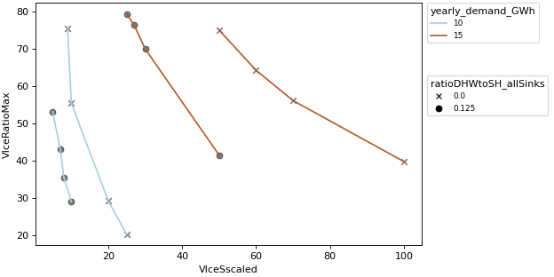
>>> api.scatter_plot(
...     comparison_data,
...     "VIceSscaled",
...     "VIceRatioMax",
...     "yearly_demand_GWh",
...     "ratioDHWtoSH_allSinks",
... )