pytrnsys_process.plot package#
Submodules#
pytrnsys_process.plot.plot_wrappers module#
Plotting wrappers to provide a simplified interface to the User, while allow development of reusable OOP structures.
Note
Many of these plotting routines do not add labels and legends. This should be done using the figure and axis handles afterwards.
- pytrnsys_process.plot.plot_wrappers.line_plot(df: DataFrame, columns: list[str], use_legend: bool = True, size: tuple[float, float] = (7.8, 3.9), **kwargs: Any) tuple[Figure, Axes][source]#
Create a line plot using the provided DataFrame columns.
- Parameters:
df (pandas.DataFrame) – the dataframe to plot
use_legend (bool, default 'True') – whether to show the legend or not
size (tuple of (float, float)) – size of the figure (width, height)
**kwargs – Additional keyword arguments are documented in
pandas.DataFrame.plot().
- Return type:
tuple of (
matplotlib.figure.Figure,matplotlib.axes.Axes)
Examples
>>> api.line_plot(simulation.hourly, ["QSrc1TIn", "QSrc1TOut"])
- pytrnsys_process.plot.plot_wrappers.bar_chart(df: DataFrame, columns: list[str], use_legend: bool = True, size: tuple[float, float] = (7.8, 3.9), **kwargs: Any) tuple[Figure, Axes][source]#
Create a bar chart with multiple columns displayed as grouped bars. The **kwargs are currently not passed on.
- Parameters:
df (pandas.DataFrame) – the dataframe to plot
use_legend (bool, default 'True') – whether to show the legend or not
size (tuple of (float, float)) – size of the figure (width, height)
**kwargs – Additional keyword arguments to pass on to
pandas.DataFrame.plot().
- Return type:
tuple of (
matplotlib.figure.Figure,matplotlib.axes.Axes)
Examples
>>> api.bar_chart(simulation.monthly, ["QSnk60P","QSnk60PauxCondSwitch_kW"])
- pytrnsys_process.plot.plot_wrappers.stacked_bar_chart(df: DataFrame, columns: list[str], use_legend: bool = True, size: tuple[float, float] = (7.8, 3.9), **kwargs: Any) tuple[Figure, Axes][source]#
Bar chart with stacked bars
- Parameters:
df (pandas.DataFrame) – the dataframe to plot
use_legend (bool, default 'True') – whether to show the legend or not
size (tuple of (float, float)) – size of the figure (width, height)
**kwargs – Additional keyword arguments to pass on to
pandas.DataFrame.plot().
- Return type:
tuple of (
matplotlib.figure.Figure,matplotlib.axes.Axes)
Examples
>>> api.stacked_bar_chart(simulation.monthly, ["QSnk60P","QSnk60PauxCondSwitch_kW"])
- pytrnsys_process.plot.plot_wrappers.histogram(df: DataFrame, columns: list[str], use_legend: bool = True, size: tuple[float, float] = (7.8, 3.9), bins: int = 50, **kwargs: Any) tuple[Figure, Axes][source]#
Create a histogram from the given DataFrame columns.
- Parameters:
df (pandas.DataFrame) – the dataframe to plot
use_legend (bool, default 'True') – whether to show the legend or not
size (tuple of (float, float)) – size of the figure (width, height)
bins (int) – number of histogram bins to be used
**kwargs – Additional keyword arguments to pass on to
pandas.DataFrame.plot().
- Return type:
tuple of (
matplotlib.figure.Figure,matplotlib.axes.Axes)
Examples
>>> api.histogram(simulation.hourly, ["QSrc1TIn"], ylabel="")
- pytrnsys_process.plot.plot_wrappers.energy_balance(df: DataFrame, q_in_columns: list[str], q_out_columns: list[str], q_imb_column: str | None = None, use_legend: bool = True, size: tuple[float, float] = (7.8, 3.9), **kwargs: Any) tuple[Figure, Axes][source]#
Create a stacked bar chart showing energy balance with inputs, outputs and imbalance. This function creates an energy balance visualization where:
Input energies are shown as positive values
Output energies are shown as negative values
Energy imbalance is either provided or calculated as (sum of inputs + sum of outputs)
- Parameters:
df (pandas.DataFrame) – the dataframe to plot
q_in_columns (list of str) – column names representing energy inputs
q_out_columns (list of str) – column names representing energy outputs
q_imb_column (list of str, optional) – column name containing pre-calculated energy imbalance
use_legend (bool, default 'True') – whether to show the legend or not
size (tuple of (float, float)) – size of the figure (width, height)
**kwargs – Additional keyword arguments to pass on to
pandas.DataFrame.plot().
- Return type:
tuple of (
matplotlib.figure.Figure,matplotlib.axes.Axes)
Examples
>>> api.energy_balance(
>>> simulation.monthly,
>>> q_in_columns=["QSnk60PauxCondSwitch_kW"],
>>> q_out_columns=["QSnk60P", "QSnk60dQlossTess", "QSnk60dQ"],
>>> q_imb_column="QSnk60qImbTess",
>>> xlabel=""
>>> )
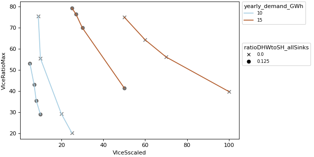
- pytrnsys_process.plot.plot_wrappers.scatter_plot(df: DataFrame, x_column: str, y_column: str, group_by_color: str | None = None, group_by_marker: str | None = None, use_legend: bool = True, size: tuple[float, float] = (7.8, 3.9), **kwargs: Any) tuple[Figure, Axes][source]#
Create a scatter plot with up to two grouping variables. This visualization allows simultaneous analysis of:
Numerical relationships between x and y variables
Categorical grouping through color encoding
Secondary categorical grouping through marker styles
Note
The way to changing colors depends on how this function is used. Categorical grouping -> use eg: cmap=”viridis” No grouping -> use eg: color=”red”
- Parameters:
df (pandas.DataFrame) – the dataframe to plot
x_column (str) – coloumn name for x-axis values
y_column (str) – coloumn name for y-axis values
group_by_color (str, optional) – column name for color grouping
group_by_marker (str, optional) – column name for marker style grouping
use_legend (bool, default 'True') – whether to show the legend or not
size (tuple of (float, float)) – size of the figure (width, height)
**kwargs – Additional keyword arguments to pass on to
pandas.DataFrame.plot().
- Return type:
tuple of (
matplotlib.figure.Figure,matplotlib.axes.Axes)
Examples
Simple scatter plot
>>> api.scatter_plot(
...     simulation.monthly, x_column="QSnk60dQlossTess", y_column="QSnk60dQ"
... )
Compare plot
>>> api.scatter_plot(
...     comparison_data,
...     "VIceSscaled",
...     "VIceRatioMax",
...     "yearly_demand_GWh",
...     "ratioDHWtoSH_allSinks",
... )

pytrnsys_process.plot.plotters module#
- pytrnsys_process.plot.plotters.plot_settings = Plot(file_formats=['.png', '.pdf', '.emf'], figure_sizes={'A4': (7.8, 3.9), 'A4_HALF': (3.8, 3.9)}, inkscape_path='C://Program Files//Inkscape//bin//inkscape.exe', date_format='%b %Y', label_font_size=10, legend_font_size=8, title_font_size=12, markers=['x', 'o', '^', 'D', 'v', '<', '>', 'p', '*', 's'])#
Settings shared by all plots
Module contents#
- pytrnsys_process.plot.line_plot(df: DataFrame, columns: list[str], use_legend: bool = True, size: tuple[float, float] = (7.8, 3.9), **kwargs: Any) tuple[Figure, Axes][source]#
Create a line plot using the provided DataFrame columns.
- Parameters:
df (pandas.DataFrame) – the dataframe to plot
use_legend (bool, default 'True') – whether to show the legend or not
size (tuple of (float, float)) – size of the figure (width, height)
**kwargs – Additional keyword arguments are documented in
pandas.DataFrame.plot().
- Return type:
tuple of (
matplotlib.figure.Figure,matplotlib.axes.Axes)
Examples
>>> api.line_plot(simulation.hourly, ["QSrc1TIn", "QSrc1TOut"])
- pytrnsys_process.plot.bar_chart(df: DataFrame, columns: list[str], use_legend: bool = True, size: tuple[float, float] = (7.8, 3.9), **kwargs: Any) tuple[Figure, Axes][source]#
Create a bar chart with multiple columns displayed as grouped bars. The **kwargs are currently not passed on.
- Parameters:
df (pandas.DataFrame) – the dataframe to plot
use_legend (bool, default 'True') – whether to show the legend or not
size (tuple of (float, float)) – size of the figure (width, height)
**kwargs – Additional keyword arguments to pass on to
pandas.DataFrame.plot().
- Return type:
tuple of (
matplotlib.figure.Figure,matplotlib.axes.Axes)
Examples
>>> api.bar_chart(simulation.monthly, ["QSnk60P","QSnk60PauxCondSwitch_kW"])
- pytrnsys_process.plot.stacked_bar_chart(df: DataFrame, columns: list[str], use_legend: bool = True, size: tuple[float, float] = (7.8, 3.9), **kwargs: Any) tuple[Figure, Axes][source]#
Bar chart with stacked bars
- Parameters:
df (pandas.DataFrame) – the dataframe to plot
use_legend (bool, default 'True') – whether to show the legend or not
size (tuple of (float, float)) – size of the figure (width, height)
**kwargs – Additional keyword arguments to pass on to
pandas.DataFrame.plot().
- Return type:
tuple of (
matplotlib.figure.Figure,matplotlib.axes.Axes)
Examples
>>> api.stacked_bar_chart(simulation.monthly, ["QSnk60P","QSnk60PauxCondSwitch_kW"])
- pytrnsys_process.plot.histogram(df: DataFrame, columns: list[str], use_legend: bool = True, size: tuple[float, float] = (7.8, 3.9), bins: int = 50, **kwargs: Any) tuple[Figure, Axes][source]#
Create a histogram from the given DataFrame columns.
- Parameters:
df (pandas.DataFrame) – the dataframe to plot
use_legend (bool, default 'True') – whether to show the legend or not
size (tuple of (float, float)) – size of the figure (width, height)
bins (int) – number of histogram bins to be used
**kwargs – Additional keyword arguments to pass on to
pandas.DataFrame.plot().
- Return type:
tuple of (
matplotlib.figure.Figure,matplotlib.axes.Axes)
Examples
>>> api.histogram(simulation.hourly, ["QSrc1TIn"], ylabel="")
- pytrnsys_process.plot.energy_balance(df: DataFrame, q_in_columns: list[str], q_out_columns: list[str], q_imb_column: str | None = None, use_legend: bool = True, size: tuple[float, float] = (7.8, 3.9), **kwargs: Any) tuple[Figure, Axes][source]#
Create a stacked bar chart showing energy balance with inputs, outputs and imbalance. This function creates an energy balance visualization where:
Input energies are shown as positive values
Output energies are shown as negative values
Energy imbalance is either provided or calculated as (sum of inputs + sum of outputs)
- Parameters:
df (pandas.DataFrame) – the dataframe to plot
q_in_columns (list of str) – column names representing energy inputs
q_out_columns (list of str) – column names representing energy outputs
q_imb_column (list of str, optional) – column name containing pre-calculated energy imbalance
use_legend (bool, default 'True') – whether to show the legend or not
size (tuple of (float, float)) – size of the figure (width, height)
**kwargs – Additional keyword arguments to pass on to
pandas.DataFrame.plot().
- Return type:
tuple of (
matplotlib.figure.Figure,matplotlib.axes.Axes)
Examples
>>> api.energy_balance(
>>> simulation.monthly,
>>> q_in_columns=["QSnk60PauxCondSwitch_kW"],
>>> q_out_columns=["QSnk60P", "QSnk60dQlossTess", "QSnk60dQ"],
>>> q_imb_column="QSnk60qImbTess",
>>> xlabel=""
>>> )
- pytrnsys_process.plot.scatter_plot(df: DataFrame, x_column: str, y_column: str, group_by_color: str | None = None, group_by_marker: str | None = None, use_legend: bool = True, size: tuple[float, float] = (7.8, 3.9), **kwargs: Any) tuple[Figure, Axes][source]#
Create a scatter plot with up to two grouping variables. This visualization allows simultaneous analysis of:
Numerical relationships between x and y variables
Categorical grouping through color encoding
Secondary categorical grouping through marker styles
Note
The way to changing colors depends on how this function is used. Categorical grouping -> use eg: cmap=”viridis” No grouping -> use eg: color=”red”
- Parameters:
df (pandas.DataFrame) – the dataframe to plot
x_column (str) – coloumn name for x-axis values
y_column (str) – coloumn name for y-axis values
group_by_color (str, optional) – column name for color grouping
group_by_marker (str, optional) – column name for marker style grouping
use_legend (bool, default 'True') – whether to show the legend or not
size (tuple of (float, float)) – size of the figure (width, height)
**kwargs – Additional keyword arguments to pass on to
pandas.DataFrame.plot().
- Return type:
tuple of (
matplotlib.figure.Figure,matplotlib.axes.Axes)
Examples
Simple scatter plot
>>> api.scatter_plot(
...     simulation.monthly, x_column="QSnk60dQlossTess", y_column="QSnk60dQ"
... )
Compare plot
>>> api.scatter_plot(
...     comparison_data,
...     "VIceSscaled",
...     "VIceRatioMax",
...     "yearly_demand_GWh",
...     "ratioDHWtoSH_allSinks",
... )