How to make plots with two y-axes#
There are multiple plots available to use in your processing steps. Here you can find examples for a line plot and a stacked bar chart. The required arguments for most plots are the dataframe and the columns you would like to plot.
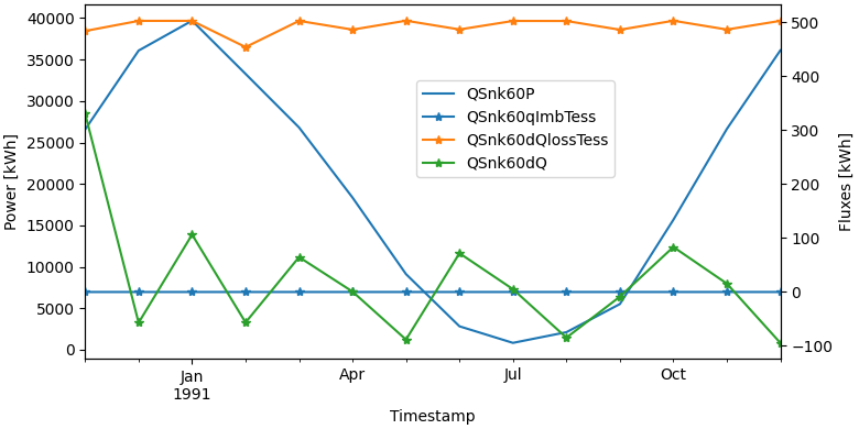
Line Plot with a single legend#
fig, lax, rax = plot.get_figure_with_twin_x_axis()
plot.line_plot(monthly_data, ["QSnk60P"], ylabel="Power [kWh]", use_legend=False, fig=fig, ax=lax)
plot.line_plot(monthly_data, ["QSnk60qImbTess", "QSnk60dQlossTess", "QSnk60dQ"], marker="*", ylabel="Fluxes [kWh]", use_legend=False, fig=fig, ax=rax)
fig.legend(loc="center", bbox_to_anchor=(0.6, 0.7))
Warning
Be careful when combining plots. MatPlotLib will not complain when you provide incompatible x-axes.
An example: combining a time-series with dates with a histogram with temperatures. In this case, the histogram will disappear without any feedback.
Note
The legend of a twin_x plot is a special case. To have all entries into a single plot, use fig.legend https://matplotlib.org/stable/api/_as_gen/matplotlib.figure.Figure.legend.html
To instead have two separate legends, one for each y-axis, use lax.legend and rax.legend. https://matplotlib.org/stable/api/_as_gen/matplotlib.axes.Axes.legend.html
Line Plot with two legends#
fig, lax, rax = plot.get_figure_with_twin_x_axis()
plot.line_plot(monthly_data, ["QSnk60P"], ylabel="Power [kWh]", use_legend=False, fig=fig, ax=lax)
plot.line_plot(monthly_data, ["QSnk60qImbTess", "QSnk60dQlossTess", "QSnk60dQ"], marker="*", ylabel="Fluxes [kWh]", use_legend=False, fig=fig, ax=rax)
lax.legend(loc="center left")
rax.legend(loc="center right")
